A century in 35 seconds: Finnish hit video illustrates global warming
Meteorological researcher Antti Lipponen from Kuopio says his phone has been ringing off the hook after he shared a 35 second animation of global temperature changes since 1900 on social media (spoiler alert: temperatures are increasing).
The 35-second clip has been watched hundreds of thousands of times since Lipponen tweeted the clip on Tuesday.
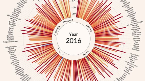
Finnish meteorological research is making the rounds on social media, as a video visualising temperature anomalies around the world in the past 117 years has been watched nearly 200,000 times in since being posted on Tuesday.
Kuopio-based researcher Antti Lipponen from the Finnish Meteorological Institute posted his 35-second video on Twitter. The visualisation shows how much the Earth has warmed since the year 1900, year-on-year in 191 countries.
Lipponen’s phone has been ringing off the hook since the video started gaining traction.
“I get a new call or notification every five seconds. It’s one way to spend the holidays!” Lipponen says blithely, and says he is not bothered by the surge in popularity.
Lipponen’s breakthrough has been picked up internationally, mostly by American sources, with Vox Media writing an article on the visualisation – with an unusual request coming from an Australian tweeter.
“They asked me if they could project the video clip onto the side of a government building,” Lipponen says.
Temperature anomalies arranged by country 1900 – 2016 ?. #dataviz #climate #climatechange #globalwarming Download ?: https://t.co/JnaU0tKDlc pic.twitter.com/w3yjmddpOe
— Antti Lipponen (@anttilip) 1 août 2017
Overnight innovation, NASA stats
Lipponen’s job involves remote sensing of fine particles in the Earth’s atmosphere and other climate-related data collection. The researcher says his hit video, which he calls a combination of work and leisure, was born in a single evening.
“I’m interested in how certain types of data can be presented in an understandable way, especially how to accurately track temperature changes,” Lipponen says.
Lipponen used open data from NASA’s Goddard Institute for Space Studies (GISS) statistics on worldwide average temperatures. The stats are updated monthly.
“I’d seen videos of planet-wide temperature changes, but large contributors to global warming tend to be overplayed in maps like that. Individual countries are better represented in my graphic, which commentors have praised,” Lipponen recounts.
Related stories from around the North:
Canada: Canada’s science minister in North to observe climate change, Radio Canada International
Finland: U.S. pullout from Paris climate pact condemned by Finnish leaders, Yle News
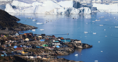
Greenland: Greenland earthquake and tsunami – hazards of melting ice?, blog by Irene Quaile, Deutsche Welle
Norway: As Arctic weather dramatically changes, world meteorologists take on more joint forecasting, The Independent Barents Observer
Russia: Putin says climate change might not be human made, The Independent Barents Observer
Sweden: Sweden’s climate minister : U.S. withdrawal from Paris sends a bad signal, Radio Sweden
United States: 3 Interior Alaska towns just had their warmest month on record, Alaska Dispatch News